Data Visualization
Made With: Excel, Colore Maps
Time in Development: 3 Weeks
The Basics
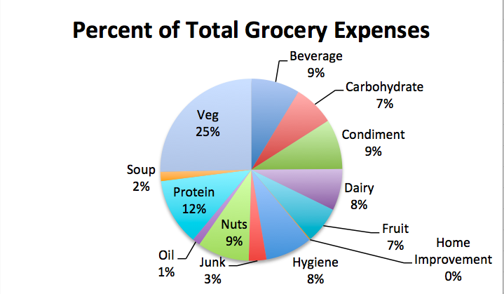
Before diving into the deep waters of educational data, I started my exploration of data visualization principles with a rather small and personal dataset: my grocery spending habits.
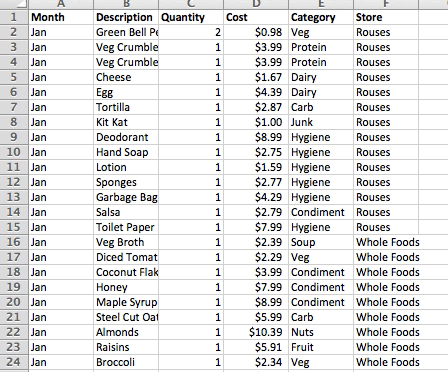
In January 2016, I began to log my monthly grocery expenses in hopes of getting a handle on my financial outflow. This data was organized by month, food, quantity, cost, category, and store.
Cleaning, Formatting, and Exploring
In his excellent Lynda course “Data Visualization Fundamentals“, Bill Shander tells us that the first step to creating a data visualization is cleaning, formatting, and exploring the data.
Some of the most common data adjustments include calculating indexes, ratios, and percentiles, aggregating, regrouping, and converting formats. My grocery categories required a little clean up, but otherwise I spent most of my time at this stage creating pivot tables to get an initial understanding of the stories underlying the data.
Rules of Visual Display
From there, I moved on to test the data with different charting functions baked into Excel, perhaps the most utilitarian of data manipulation and visualization tools. In experimenting with a variety of chart types, labels, and scales, I worked to follow Shander’s principle of “choosing the rules needed for data to breathe form into geometric abstractions”.
In particular, three qualities are key to keep in mind when choosing the rules of visual display:
- Tangibility: make the intangible tangible.
- Simplicity: make the complex simple.
- Context: establish and emphasize themes.
For a basic and rather personal data visualization like this, the relative simplicity of the data means that the viewer is not likely to have a desire to “dig deep”. I found it more suitable in this case to offer a relatively straightforward story that encourages the viewer to step through the visualization in a linear way.
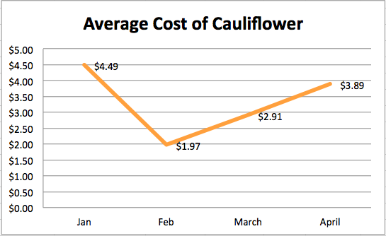
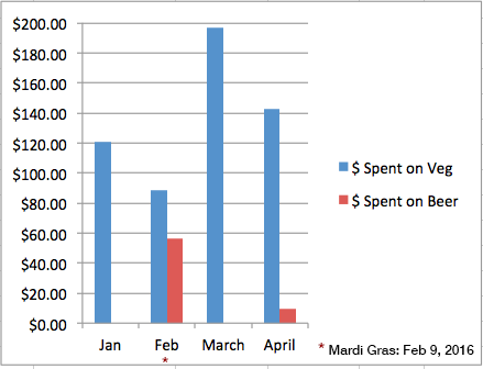
There were a number of stories that this data tells: the relative costliness of Whole Foods products compared to those sold in my local grocery chain, the oddly shifting price of cauliflower, and the effect of Mardi Gras on a New Orleanian’s healthy eating habits.
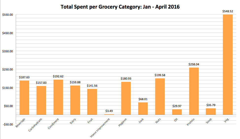
The story that seemed to jump the most out of this data, though, was the relative priciness of a largely plant-based diet, with 25% of all grocery expenses over the quarterly period coming from vegetables.
Educational Dataset: Student-level data from HarvardX and MITx courses in 2013
Transitioning from personal to real-world educational data meant a big jump in the size of the datasets I was working with. For this next level of exploration of data visualization, I worked with a set of de-identified student-level data from the first year of HarvardX and MITx courses offered through the edX MOOC platform (the 2013 academic year). Interested readers can find the dataset here: MITx and HarvardX Dataverse
This dataset included information about registered users’ geographic distribution, navigation, participation, and interactions with course content. There was a lot to unpack here, so I began by examining what is often considered one of the weakest, yet most promising areas of MOOCs: social interaction.
This bar chart shows the steep drop off of participation in the course discussion forums, with over 600,000 registrants never posting to a forum at all.

This line chart demonstrates a similar drop off, here showing the number of users active in the course for more than one day.
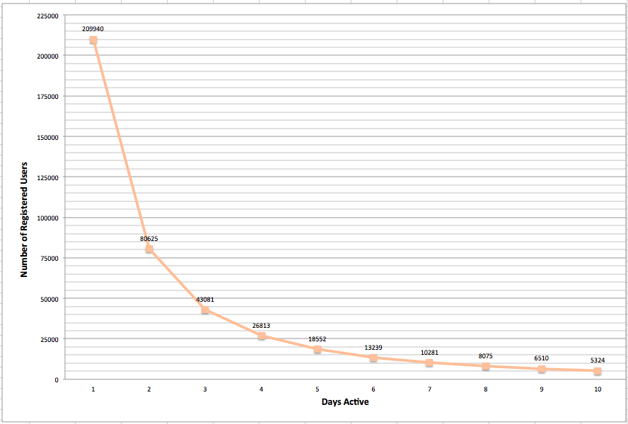
As the Data Visualization Fundamentals course suggested, bar charts proved to be nearly a default choice, powerful in their visual simplicity.
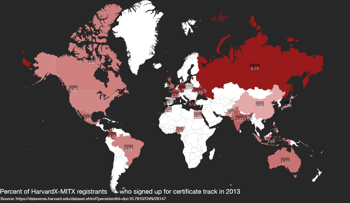
However, the global distribution of the registrants represented in this dataset offered an opportunity to experiment with choropleth maps. To create the map below, I used Colore Maps, a free and fairly intuitive web-based service. This choropleth shows the percentage of users registered in MITX and HarvardX courses in 2013 who enrolled in a paid certificate track. In making decision decisions about this map, I was conscious to include text labels for those readers who are unable to clearly distinguish color variation.
Moving Forward
I have a long way to go to attain a skill set on par with information designers like the amazing Giorgia Lupi. Still, this initial foray into the fundamentals of data visualization has shown me the power of using the human senses to support understanding of complex information.
Seemingly endless tools and libraries for data visualization abound online – some built with a GUI, some built with Javascript – so the open question at this point is which to pursue in greater depth moving forward.