HTML5 and Responsive Design
Made With: HTML5, CSS3, Brackets
Time in Development: 3 Weeks
Go to the Site: Avenue PM HTML5 Prototype
HTML5
Studying HTML5 offered an opportunity to gain a deeper understanding of the structure and semantics of the modern web. For this project, I focused on ensuring that my code is well-organized, in particular targeting the header, section, article, figure, and footer tags.
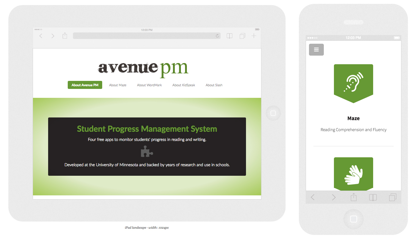
New to HTML5 is the canvas element, which allows for dynamic scripting of 2D shapes and images on a website. Canvas has found wide use among browser-based game designers and offers a useful replacement for Flash animations. My execution of this new element on the Avenue PM project site was more limited in scope – it is used here to dynamically load the animal icons at the top of the right sidebar on the four app pages. I attempted to follow best-practice standards by offering fall-back content for users with older browsers that don’t support the canvas element.
Moving forward, I plan to learn more about using Schema.org metadata to extend the structural and semantic value of my code.

var can = document.getElementById(‘myCanvas’);
var ctx = can.getContext(‘2d’);
var img = new Image();
img.src = ‘http://mariawidmer.com/html5_avepm/images/animal3.png’;
window.onload = function() {
can.width = img.width;
can.height = img.height;
ctx.drawImage(img, 0, 0, img.width, img.height);
};

CSS3
CSS3 is the latest standard for the Cascading Style Sheets language. Some of the new features used in the CSS for the Avenue PM prototype site are a browser-generated gradient background, font-smoothing, box-sizing, and transitions on button elements. One best practice for using newer or experimental CSS3 modules is to include vendor prefixes to ensure functionality across browsers.
In experimenting with new style features, I worked to follow principles of Progressive Enhancement. This is a strategy for design that emphasizes writing code in a way that allows all browsers to access the basic content and functionality of a website, even if the user has a low bandwidth connection or has turned off JavaScript. I learned that using icon-based font libraries like Font Awesome instead of having users load icon images is a good way to increase a website’s speed.
Responsive Design
To scaffold my process of learning to design a responsive website, I started with a basic template from HTML5 UP. This served to model one approach to structuring and styling a responsive site with media queries for mobile, tablet, and desktop browsing.
From there, I worked to make a responsive container for the iframe element that contains the YouTube videos introducing each Avenue PM app. As the videos are nested in a fairly small sidebar, they needed to start small and get progressively larger as the browser size decreases. In the mobile styling, the videos occupy the full width of the screen.
One of the latest changes to CSS is the addition of the Flexbox Layout module. This mode (as of May 2016 a W3C Candidate Recommendation) promises to simplify the responsive design process with its grid- and container-based model of building layouts. I’m excited to learn more about using Flexbox to improve the responsive flow of the Avenue PM prototype and my future web designs, and plan to take the Advanced Responsive Layouts with CSS Flexbox Lynda course as the next step in my HTML5 and Responsive Design journey.