Learning Analytics and Info Visualization
for Educational Decision-MakingThe Design Context
As the analytics engines of Learning Management Systems grow increasingly robust and digital tools for assessment abound, the learner data available to many 21st century educators can be a rich resource for decision-making. Too often, though, teachers are left alone to make sense of overwhelmingly large or complex datasets. Given the pressures of their key competing responsibilities, it is little wonder if teachers choose to set aside dense numerical data and instead focus on what they can see, hear, and sense about their learners firsthand.
Avenue PM offers a response to the plight of the modern teacher.
A web-based student progress management system, Avenue PM offers a suite of four assessments with game-like features to measure different aspects of learners’ literacy development. Teachers can easily score these assessments, track learner progress over time, and identify moments when intervention may be needed. In support of this last goal, Avenue PM offers a system of information visualizations.
Information visualizations use graphics and interactive digital elements to ease the cognitive overload of parsing so-called “big data”.
Effective visualizations make the human narratives that underlie the numbers perceptible, meaningful, and actionable.
The Design Challenge
Launched in 2005 at the University of Minnesota by Drs. Simon Hooper and Sue Rose, Avenue PM has in the past decade expanded to a national user base. In that time, among other foci, system redesign efforts have targeted the information visualization interface.
One primary design goal has been to improve the salience of student progress trends through readily comprehensible data visualizations in order to support teachers’ decision- and sense-making (Hooper, Miller, Rose, 2013, p. 264).
It has been my privilege to join the Avenue PM team as a programming intern under the leadership of Penn State University Professor of Education Simon Hooper. In collaboration with a team of graduate and undergraduate programmers, I have worked primarily on the redesign of the Avenue PM information visualization interface. This experience has offered a unique opportunity to better understand both the kinds of data that are important to educators and the best-practice strategies for developing technology to support teacher needs.

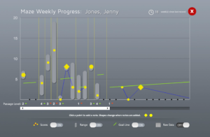
Early design of Avenue PM Information Visualization

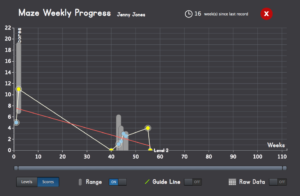
Mid-cycle design of Avenue PM Information Visualization
As the Avenue PM system has transitioned from a Flash-based environment to one built on “device- and browser-agnostic technologies” like HTML5, jQuery, and AJAX, the technologies underlying the information visualization system have likewise shifted (Hooper et al., 2013). The most recent iteration of the Avenue PM InfoViz interface is built on D3, a Javascript library for producing dynamic, interactive data visualizations.
Responding to feedback offered by longtime users, the design and programming team has focused on developing a clean and comprehensible interface, a system of helpful hints for teachers, and an interactive range selector.
The Design Results
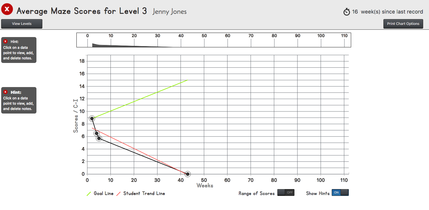
As of October 2016, the most recent design of the interface offers significant improvements in the user experience. The clean and bright aesthetic allow teachers to focus on the information that matters most: trends and changes in student performance over time.

Latest design of Avenue PM Information Visualization (Oct. 2016)
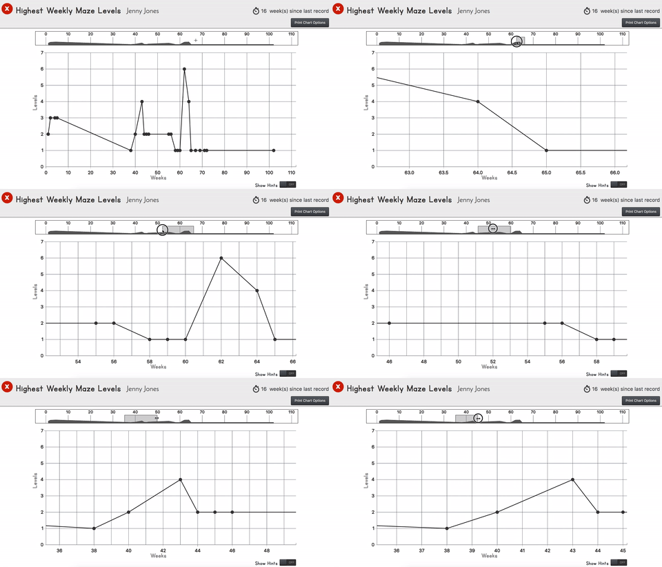
One of the redesign efforts that I had the privilege to lead was the introduction of an interactive, graphical range selector. Earlier designs made use of a scroll bar at the bottom of the interface.
With the help of Andy Aiken’s tutorial, I developed a dynamic range selector with which users can pan and zoom through student data. As Aiken notes, the navigation chart offers a miniaturized graphical overview of the full range of data, which means that even while zoomed in, users can quickly see the relationship between the full dataset and the part of the graph they are currently observing.

As of now, the latest redesign has received positive feedback from a select test group. While Avenue PM will undoubtedly continue to develop as it moves through the full range of iterative design cycles, I believe the latest changes will offer some reprieve to today’s data-overloaded teachers as they work to help their learners achieve success in their literacy development.
My sincere thanks to Dr. Simon Hooper and Sagun Giri for their guidance in leading the design process. Thanks also to Nnamdi Nnamdi-Emetaromn, Karol Kolc, Charles Penunia, and Divyan Sehgal for their motivational programming work and supportive partnership as true design “conspirators” (Nelson & Stolterman, 2012).
References
Hooper, S., Miller, C., & Rose, S. (2013). Considering the Design of an Electronic Progress-Monitoring System. In R. Luckin, S. Puntambekar, P. Goodyear, B. Grabowski, J. Underwood, & N. Winters (Eds.), Handbook of Design in Educational Technology (pp. 256-267). New York, NY: Routledge.
Nelson, H. G., & Stolterman, E. (2012). The design way: Intentional change in an unpredictable world. Cambridge, MA: The MIT Press.

