Adobe Photoshop: Graphic Design Fundamentals
Made With: Adobe Photoshop, Adobe Lightroom
Time in Development: 3 Weeks
The Inspiration
The almost impossibly charming M.C. Escher-inspired Monument Valley game has served for me as a paragon of aesthetic appeal from the moment it finished installing on my home screen. With rich color palettes and pleasantly sharp geometric components, the visual element of the game alone engages the player.
So who better to learn visual design principles from than ustwo, creators of Monument Valley and authors of “Pixel Perfect Precision“, a handbook on contemporary digital design principles, practices, and tools? While sharing strategies for designing at the micro-level (targeting text alignment, border radii, and object spacing among other details), ustwo also offers a big-picture perspective, teaching the novice designer best-practice strategies for accessibility, version control, and organization of assets.

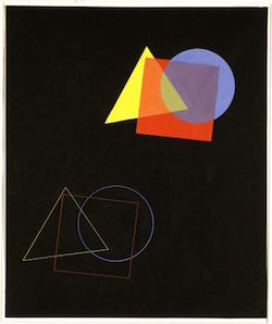
Eugen Batz, “The Spatial Effect of Colours and Shapes”, exercise from Wassily Kandinsky’s class, (1929)
Before diving too deeply into digital design, though, a return to the basics was in order. To that end, I turned from 21st century pixels and Photoshop to the color theory of the Bauhaus school in post-WWI Germany. With a profound influence on modernism in art, design, and architecture, the Bauhaus movement sought to align form and function and spiritually merge fine arts, crafts, and engineering into a utopian “total art”.
One of the school’s many celebrated artist-instructors, Wassily Kandinsky took a particular interest in form, shape, and color as the building blocks of visual design. Kandinsky passed on to his students his color theory, characterized in part by an argument that every color has both a physical and psychological effect on a viewer. Brighter and warmer colors catch the eye and energetically move forward on the page, while cool colors recede, evoking calmness or stability. When aligned in different configurations, these resonances of colors interact and change accordingly.
To explore some of these interactions, I practiced one of Kandinsky’s instructional exercises, experimenting with arrangements of blocks of primary, secondary, and non-colors.
The Results

Vertical Balance

Visual Emphasis on Center
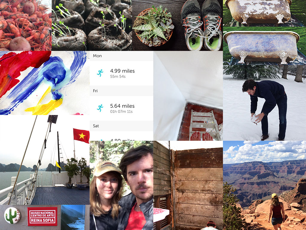
With a basic grasp on the foundations of visual design, I transitioned back to a more modern approach and toolkit. Using Adobe Lightroom and Photoshop, I compiled a collage of images that characterize my travels, my seemingly never-ending tinkering with household projects, and the quotidien moments of pleasure that brighten everyday life.
One personal standard towards which I strive is minimalism as a physical and mental state, so I attempted to convey that quality through the use of white space in the collage. Building on that foundation, I hoped to create flows of color that lead the eye across the canvas:
- Red and yellow, which move diagonally from the crawfish in the top left corner through the red of my husband’s shirt in the bottom center.
- Bright green, which flows across the top third of the collage
- Blues and whites in the sky, snow, and coat on the right.
- Stratified layers of white and brown, from the painted wall, to the bathtub, to the sedimentary rock of the Grand Canyon.
With my final creation I felt an homage to the Bauhaus giants was in order. Wanting to experiment with a more freeform approach using Photoshop’s wide kit of brush types, I took inspiration again from Kandinsky’s work in form and color. I especially liked the crosshatched lines and color overlays in his 1923 work “Circles in a Circle” (right).
Using a textured layer with reduced opacity to give the effect of an ink wash over the canvas, I attempted to “paint” using the brushes at my disposal.
As the Bauhaus artists worked to fuse art, craft, and engineering into an elevated union of form and function, instructional designers join art (kunst) and science (wissenschaft) to spark transformative learning experiences. My banner image, then, is a celebration of that holy union.
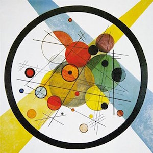
Kandinsky “Circles in a Circle” (1923)